Purple and Green: Meaning, Aesthetic Power & Creative Ideas explores color psychology, design inspiration, fashion & creativity.!!!
I still remember the first time I saw the combination of purple and green used intentionally in a Bohemian design. It wasn’t in a textbook or a formal art class. It was actually on a festival poster I passed by while scrolling online late at night. Something about it stopped me. It felt bold, slightly chaotic, but also strangely beautiful.
At first glance, I thought, “Do these colors even belong together?”
But the more I looked, the more it made sense.
That’s the interesting thing about purple and green, they don’t just “match” in a traditional sense. They challenge your visual expectations. And that’s exactly why designers, creators, and even everyday users keep searching for this color combination.
In this article, we’ll explore everything behind purple and green, from color psychology and cultural meaning to real-world design inspiration, fashion ideas, and practical usage tips. Whether you’re a designer, blogger, or just someone curious about aesthetics, this guide will help you understand why this pairing is so powerful.
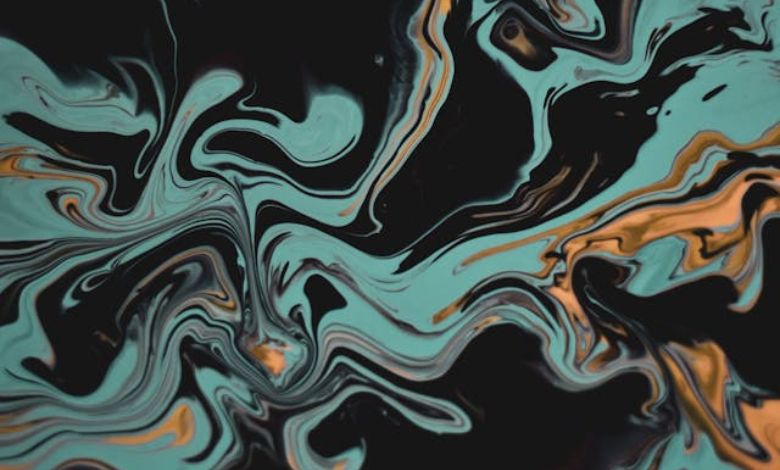
What Makes Purple and Green So Visually Interesting?
At its core, purple and green is not a classic complementary color pairing like blue and orange or red and green. Instead, it’s what designers often call a dynamic contrast combination.
Here’s why:
- Purple is made from red + blue (a mix of warm and cool energy)
- Green comes from blue + yellow (a fresh, natural tone)
So when you place purple and green together, you’re not just combining colors, you’re combining emotional opposites that still share a blue base. This creates a tension that feels both balanced and unpredictable.
I once tried using purple and green for a personal blog header, thinking it might look messy. Surprisingly, it didn’t. It looked alive. Like it had personality.
That’s the magic of this pairing, it refuses to be boring.
Color Psychology: What Purple and Green Actually Communicate
Colors speak a silent language, and purple and green tell a surprisingly rich story.
Purple: imagination and luxury
Purple is often linked with:
- Creativity
- Mystery
- Royalty
- Imagination
It feels artistic and slightly dreamy, like stepping into a fantasy world.
Green: nature and balance
Green represents:
- Growth
- Calmness
- Nature
- Stability
It grounds you. It feels familiar, like walking through a forest after rain.
Together: a strange but beautiful contradiction
When combined, purple and green create an emotional blend of:
- Fantasy + nature
- Magic + reality
- Creativity + stability
It’s like imagining a glowing enchanted forest, real enough to feel familiar, but magical enough to feel unreal.
Cultural and Aesthetic Associations of Purple and Green
One of the reasons purple and green keeps appearing in design trends is because it already carries cultural weight.
Mardi Gras influence
In festivals like Mardi Gras, purple and green are often part of a vibrant tri-color scheme. They represent celebration, energy, and visual excitement.
Gaming and digital art
If you’ve spent time in gaming UI or fantasy-themed interfaces, you’ve probably seen purple and green used for:
- Magical abilities
- Energy effects
- Fantasy landscapes
It gives off a “not from this world” vibe, which is perfect for games.
Social media aesthetics
On platforms like TikTok and Pinterest, purple and green frequently appears in:
- Aesthetic edits
- Neon cyberpunk themes
- Fantasy-style visuals
It’s not accidental. It’s a trend driven by emotional impact.
Why Designers Love Purple and Green (Even When It’s Risky)
I’ll be honest, when I first started experimenting with design, I avoided purple and green because it felt risky. It didn’t have the “safe harmony” of beige palettes or monochrome schemes.
But experienced designers actually use that risk intentionally.
Here’s why:
1. It grabs attention instantly
Our brains are wired to notice contrast. Purple and green creates a visual “pause moment.”
2. It feels modern and experimental
It breaks traditional design rules, which makes it perfect for:
- Branding
- Posters
- Digital art
- Creative campaigns
3. It supports storytelling
A palette of purple and green often feels like a world, not just a color choice.
Best Real-World Uses of Purple and Green
This is where purple and green becomes practical, not just aesthetic.
Fashion and outfits
This combo can look stunning when balanced correctly:
- Deep purple jacket + muted green pants = bold streetwear
- Lavender top + sage green skirt = soft aesthetic style
- Neon accents = futuristic or rave-inspired look
It’s not common, which is exactly why it stands out.
Interior design
In home décor, purple and green works best when one tone dominates:
- Green walls + purple accents = calming yet creative room
- Purple furniture + green plants = natural-meets-luxury vibe
I once saw a café using deep purple lighting with indoor plants everywhere. It felt like stepping into a dream.
Gaming and UI design
In digital spaces, purple and green is often used for:
- Magic effects
- Health vs energy contrast
- Sci-fi interfaces
It’s visually strong and easy to notice during gameplay.
Beauty and aesthetics
- Nail art
- Hair dye combinations
- Makeup accents
Especially in creative beauty trends, purple and green shows up in bold experimental looks.
Color Pairing Variations (With HEX Ideas)
One of the biggest mistakes people make is using purple and green without adjusting tone. Saturation matters a lot.
Here are safer combinations:
- Royal purple #6A0DAD + forest green #228B22 → elegant and rich
- Lavender #C8A2C8 + mint green #98FF98 → soft and aesthetic
- Neon purple #A020F0 + neon green #39FF14 → cyberpunk energy
Each version of purple and green tells a completely different story.
SEO Insight: Why People Search Purple and Green
From a content perspective, purple and green is what we call a seed keyword. That means it branches into many related search intents like:
- purple and green aesthetic
- purple and green outfits
- purple and green room ideas
- purple and green hair
- purple and green color palette
This is important because users are not just searching for information, they are searching for inspiration.
What Users Actually Want (Search Intent Breakdown)
When someone types purple and green, they are usually looking for:
Visual inspiration
They want to see how it looks in real life.
Meaning and psychology
They want to understand the vibe or emotional impact.
Practical usage
They want ideas they can apply immediately.
Design guidance
They may also want color codes or combinations.
So the best content is not theoretical, it’s visual, practical, and inspiring.
How I Personally Started Appreciating Purple and Green
I’ll share something personal here.
For a long time, I stuck to “safe” color palettes, blues, whites, grays. Nothing too loud. Nothing too risky.
Then one day, while experimenting with a small side project, I tried purple and green just out of curiosity. I expected it to look chaotic.
Instead, it looked alive.
Not perfect. Not calm. But expressive.
That’s when I realized something important: design doesn’t always need to be safe. Sometimes it needs to be memorable.
And purple and green is nothing if not memorable.
Key taking
- At the end of the day, purple and green is more than just a color combination.
- It’s a creative statement.
- It represents contrast, imagination, and boldness.
- It’s used in fantasy worlds, digital art, fashion, and modern aesthetics because it refuses to blend into the background.
- If you want something subtle, this is not your palette.
- But if you want something expressive, something that makes people stop and look twice, then purple and green might be exactly what you need.
- And maybe that’s the real beauty of it, it doesn’t ask for permission to stand out.
- It simply does.
Additional Resources
- https://www.verywellmind.com/color-psychology-2795824: A trusted psychology source explaining how colors influence emotions, mood, and perception in human behavior.
- https://www.britannica.com/science/color: An academic reference covering how color works physically, psychologically, and artistically.


